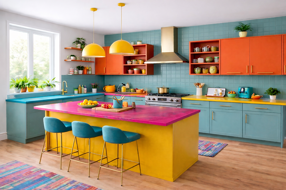
The Color Comeback
- Jan 19
- 4 min read

How a more expressive approach to design is reshaping American homes
For years, American interiors followed a familiar rhythm. Open layouts dressed in white. Floors washed in gray. Walls softened by beige and everything in between. The look was clean, predictable, and easy to sell—both literally and figuratively. It promised calm, order, and modernity.
And for a while, it delivered.
But homes aren’t meant to be static. They’re meant to hold life. And increasingly, homeowners are realizing that something essential has been missing. Spaces that once felt serene now feel impersonal. Rooms designed to appeal to everyone end up connecting with no one in particular.
That’s why color is returning—not as a trend, but as a correction. A return to warmth, individuality, and emotional connection. The modern color comeback isn’t about boldness for the sake of boldness. It’s about creating homes that feel lived in, layered, and deeply personal.
When Neutral Became the Default—and Why It’s Changing
Neutral palettes didn’t always dominate interior design. Their rise in the early 2000s was, in many ways, a response to visual excess. After decades of saturated hues, heavy ornamentation, and maximalist expression, minimalism felt refreshing. Clean lines and subdued color offered a sense of control and simplicity.
Design shows reinforced the formula. Gray floors became synonymous with sophistication. White kitchens were labeled timeless. “Greige” emerged as the safest choice of all. But safety, over time, can become limiting.
After spending more time at home than ever before, many people began to see their spaces differently. What once felt calm began to feel hollow. Neutral-on-neutral stopped feeling restful and started feeling unfinished. Homes were beautiful—but emotionally distant.
Today, homeowners want spaces that respond to them. Rooms that feel warm in the morning, grounding in the evening, and welcoming at all hours. Color answers that need in a way nothing else can.
The Emotional Language of Color
Color is deeply human. We respond to it instinctively, often without realizing it.
Blues slow us down and create mental clarity.
Greens reconnect us to nature and restore balance.
Yellows bring optimism and warmth.
Reds energize and awaken.
Purples add depth and quiet luxury.
Earth tones—sand, clay, stone—ground us and create a sense of belonging.
These responses aren’t arbitrary. They’re rooted in biology, psychology, and memory. Color shapes how we feel in a space, how long we linger, and how connected we feel to our surroundings.
In a home, color becomes more than decoration. It becomes atmosphere. Mood. Memory.
A History Written in Color
Throughout history, color has always reflected how people lived and what they valued.
In ancient civilizations, richly pigmented walls and materials symbolized power, spirituality, and refinement. Roman villas were wrapped in frescoes that brought nature and mythology indoors. During the Renaissance, color returned as an expression of humanity, balance, and beauty.
Later eras used color to express intimacy and status. Victorian homes leaned into deep, enveloping hues. Rococo interiors favored softness and romance. Mid-century design celebrated optimism with playful palettes, while the 1970s embraced warmth and earthiness.
Each period spoke through color.
The minimalist era spoke too—of efficiency, restraint, and universality. But today’s shift toward color reflects something new: a desire for individuality, emotional comfort, and spaces that feel personal rather than perfected.
Bringing Color Back—Thoughtfully
Reintroducing color doesn’t mean overwhelming a space. In fact, the most enduring interiors use color with intention.
Start with one room. A dining room, office, or powder room offers the freedom to explore deeper tones without commitment.
Think in layers. Color blocking, tonal variations, and subtle contrast add depth while keeping the space grounded.
Look beyond walls. Cabinetry, tile, built-ins, doors, and ceilings create opportunities for expression that feel integrated rather than decorative.
Let materials speak. Natural stone, textured surfaces, and warm finishes introduce color in a way that feels organic and lasting—never forced.
When color is paired with thoughtful materials, it becomes timeless rather than trendy.
The Kitchen: Where Color Feels Most Alive
The kitchen is more than a workspace. It’s where mornings begin, conversations unfold, and routines become rituals. It carries more emotional weight than almost any other room in the home.
For years, kitchens followed a narrow aesthetic path—bright, neutral, and uniform. But today, they’re becoming expressive again.
Rich cabinetry in navy, olive, or clay tones. Warm stone surfaces that feel tactile and grounding. Tile that introduces pattern, movement, and color without overpowering the space.
Color in the kitchen doesn’t just change how it looks—it changes how it’s experienced. Cooking feels more intentional. Gathering feels more natural. The room finally reflects the life happening within it.
Real Homes, Real Change
Across the country, homeowners are rediscovering what color can do.
A white kitchen softened and grounded by deep blue cabinetry becomes both striking and timeless.
A guest bedroom layered in green turns into a quiet retreat.
An entryway wrapped in color creates an immediate sense of welcome.
These transformations don’t just elevate aesthetics—they change how people feel when they walk through the door.
A Home That Reflects You
Your home doesn’t need to follow rules. It doesn’t need to impress future buyers or mirror what’s trending online. It needs to feel right.
Color gives you permission to choose warmth over uniformity. Expression over restraint. Emotion over perfection.
Whether it’s through bold hues or subtle, stone-inspired tones, color helps create spaces that feel human—layered, intentional, and enduring.
Paint the ceiling.
Choose the tile that speaks to you.
Let texture, material, and color work together.
Create a home that feels like it belongs to you—because it does.


Comments